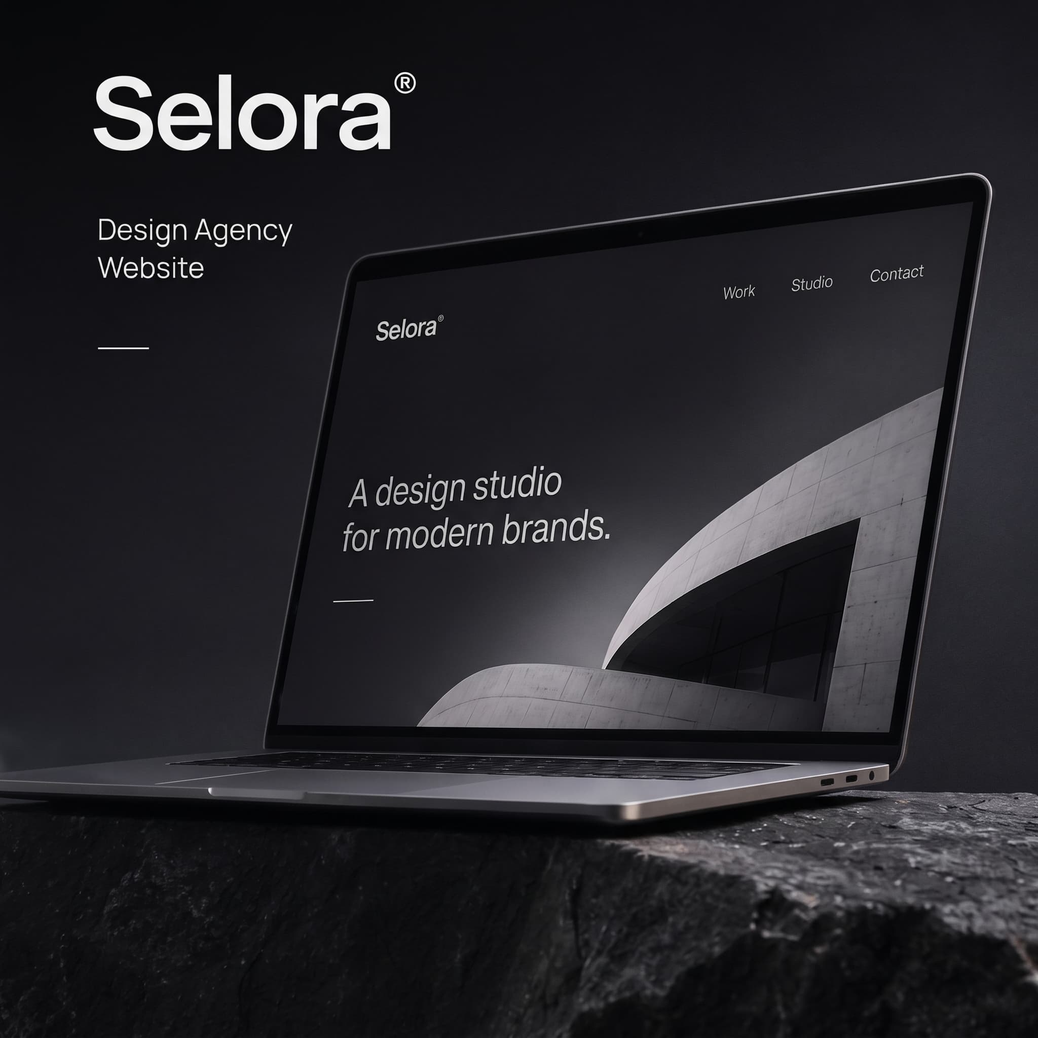
A website for a design studio that wanted its own site to be the best piece in its portfolio.
Website
Motion
The brief
Selora is a small studio that designs for modern brands. Its old site was a grid of thumbnails, and visitors left without understanding how the studio thinks.
What I designed
I designed the site as an editorial experience with one strong idea per screen.
A hero built around a single statement and monochrome architecture.
Case study pages with long-form storytelling and full-bleed imagery.
A restrained black and white palette that lets the client work bring the colour.
Page transitions and scroll motion, specified for development.
The result
A site that presents the studio's thinking as clearly as its visuals, built so the team publishes new work on their own.
One statement per screen, with the architecture doing the rest.Detail