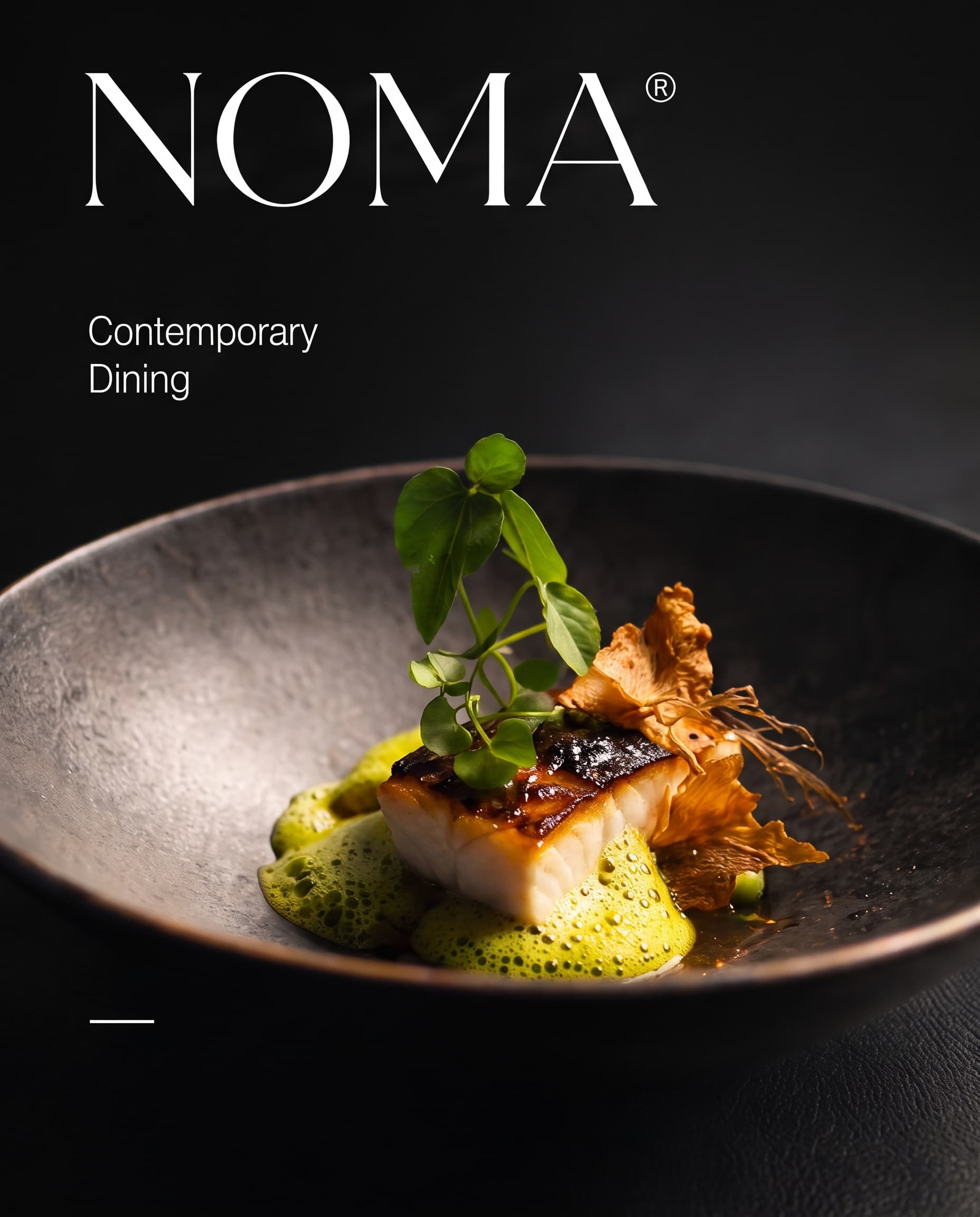
Branding for a contemporary restaurant that serves a short seasonal menu in a dark, intimate room.
Branding
Menu design
The brief
NOMA opened with a tasting menu that changes every few weeks. The team needed an identity as considered as the food, and a menu system the kitchen could update overnight.
What I designed
The brand borrows its mood from the dining room: low light, dark stone and one bright plate.
An elegant high-contrast serif wordmark for signage, menus and napkins.
A menu template the chef edits in minutes when the season turns.
Food photography direction with a single light source and deep shadow.
A reservation flow and website that keep the same quiet tone.
The result
An identity that carries from the door sign to the dessert menu, and menus that change as fast as the kitchen does.
One light source, dark stone and a single bright plate.Detail