A brand identity for a boutique law firm that wanted to look as precise as its contracts.
Brand identity
Stationery
The brief
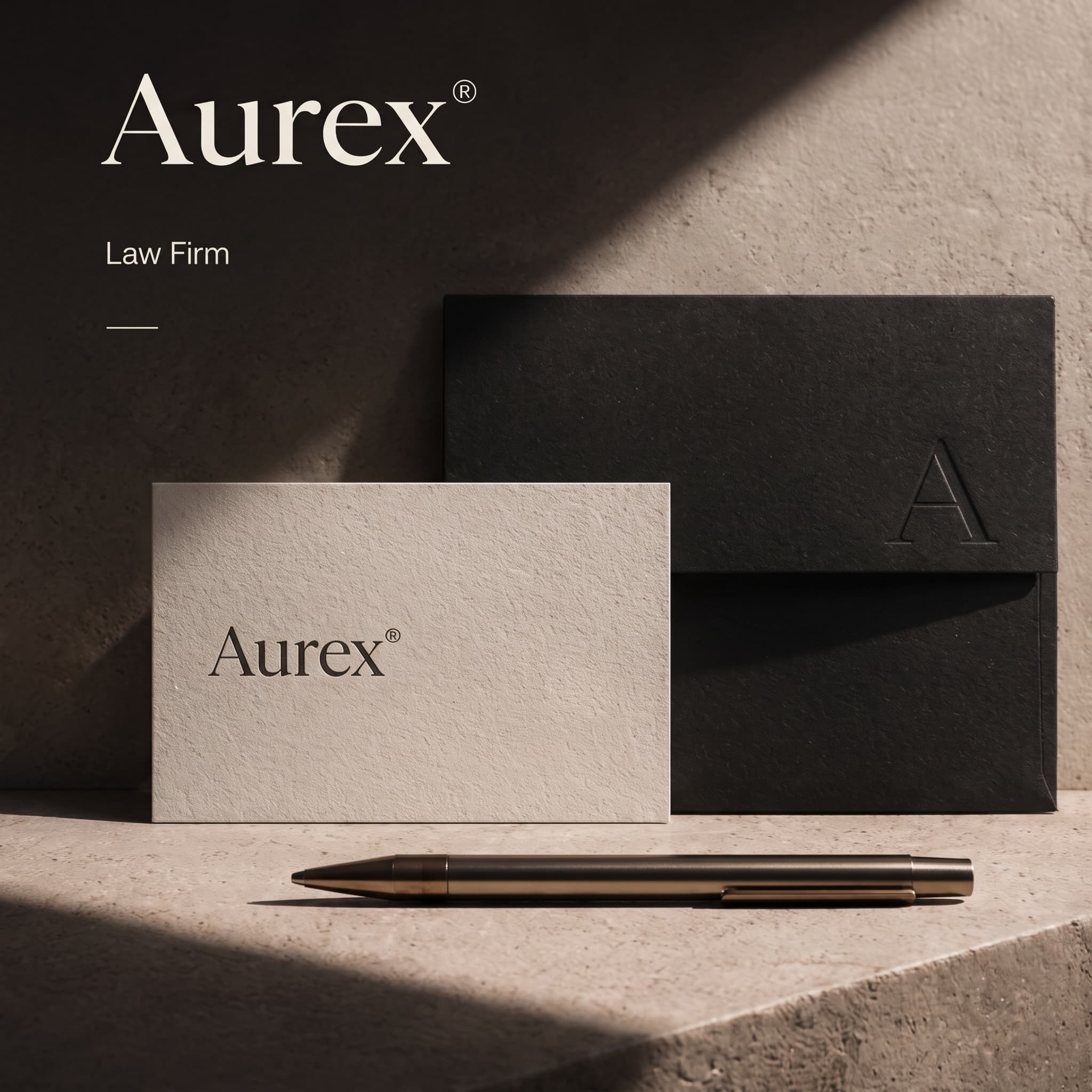
Aurex advises founders and family businesses on corporate law. The partners wanted to move away from the navy and gold of their competitors, towards something quieter and more modern.
What I designed
The identity is built on restraint: one serif, warm stone tones and a monogram.
A refined serif wordmark and an A monogram for seals and stamps.
Letterpress stationery on textured stock, with a black envelope.
Document and pitch templates that keep long agreements easy to read.
A simple website that leads with the partners and their practice areas.
The result
A calm, confident identity clients notice from the first business card, and templates the whole firm uses every day.
Letterpress on textured stock, read in raking light.Detail