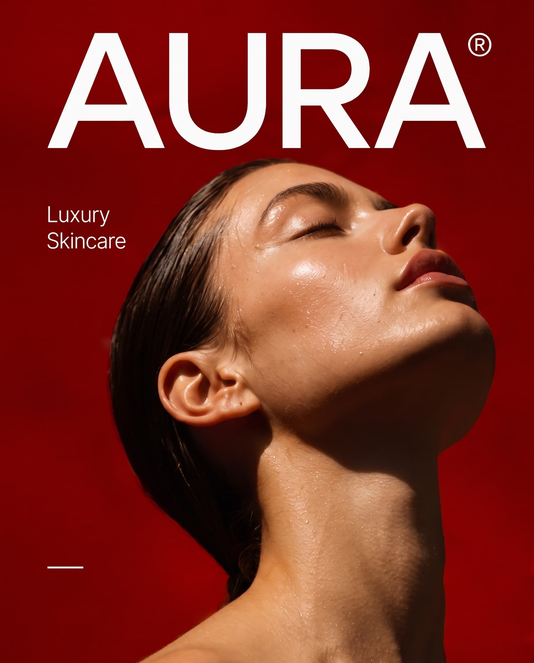
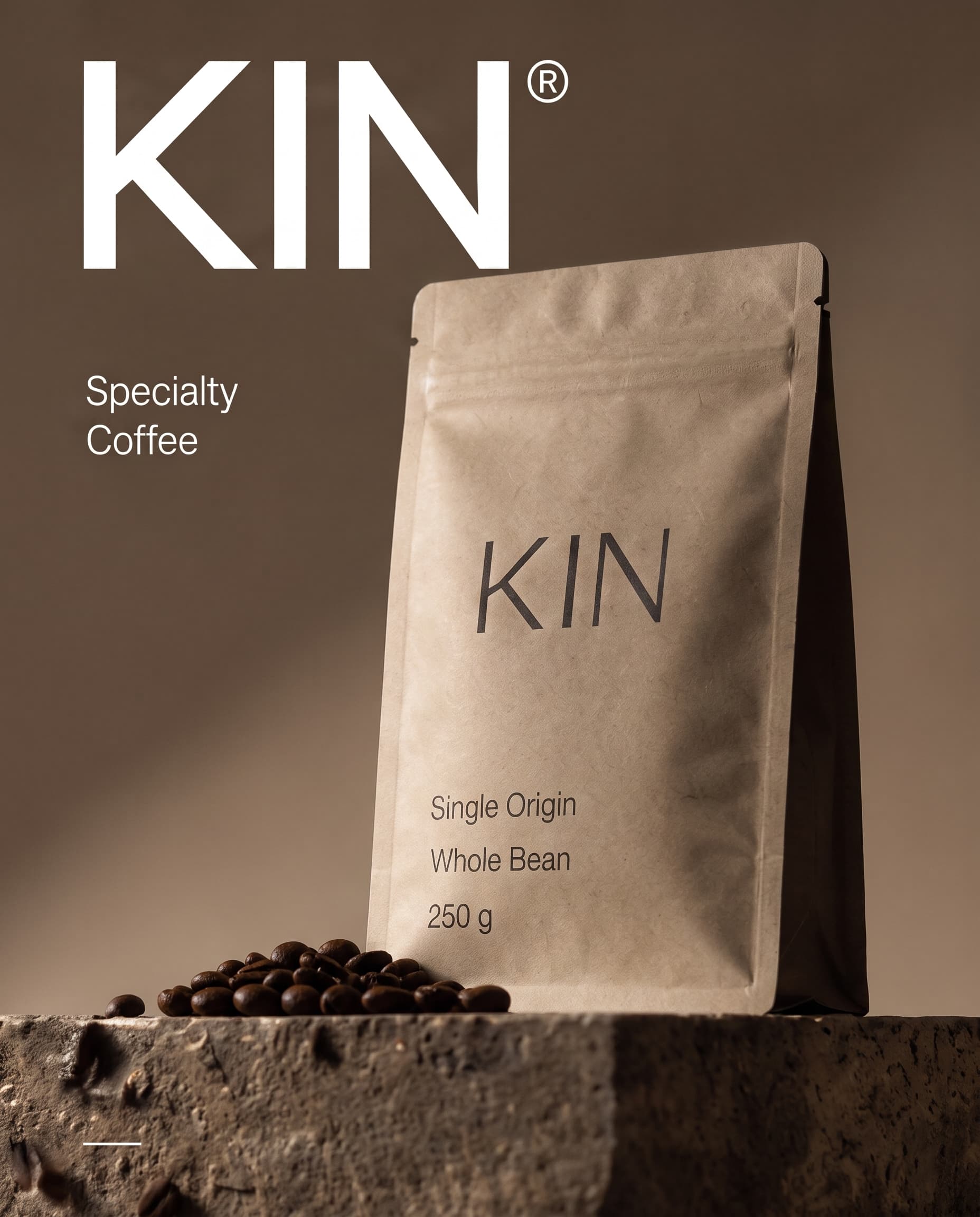
A brand identity for a luxury skincare house, built on bare skin, deep red and a wordmark with nothing to hide.
Brand identity
Art direction
The brief
AURA was launching a short line of clinical skincare at a luxury price. The founders wanted the brand to feel sensual and confident, without the gold foil and marble every competitor reaches for.
What I designed
I built the identity around one idea: skin in warm light, framed by a single saturated colour.
A wide geometric wordmark that holds its own on a billboard and on a 15 ml bottle.
A palette led by one deep red, with ivory and warm skin tones in support.
Art direction for the campaign photography: close crops, wet skin, hard sunlight.
Packaging, social templates and a short brand book for the launch team.
The result
A launch kit the team used for packaging, the website and the first campaign, with one look that reads as AURA from across a room.
Hard sunlight and one saturated red carry the whole identity.Detail