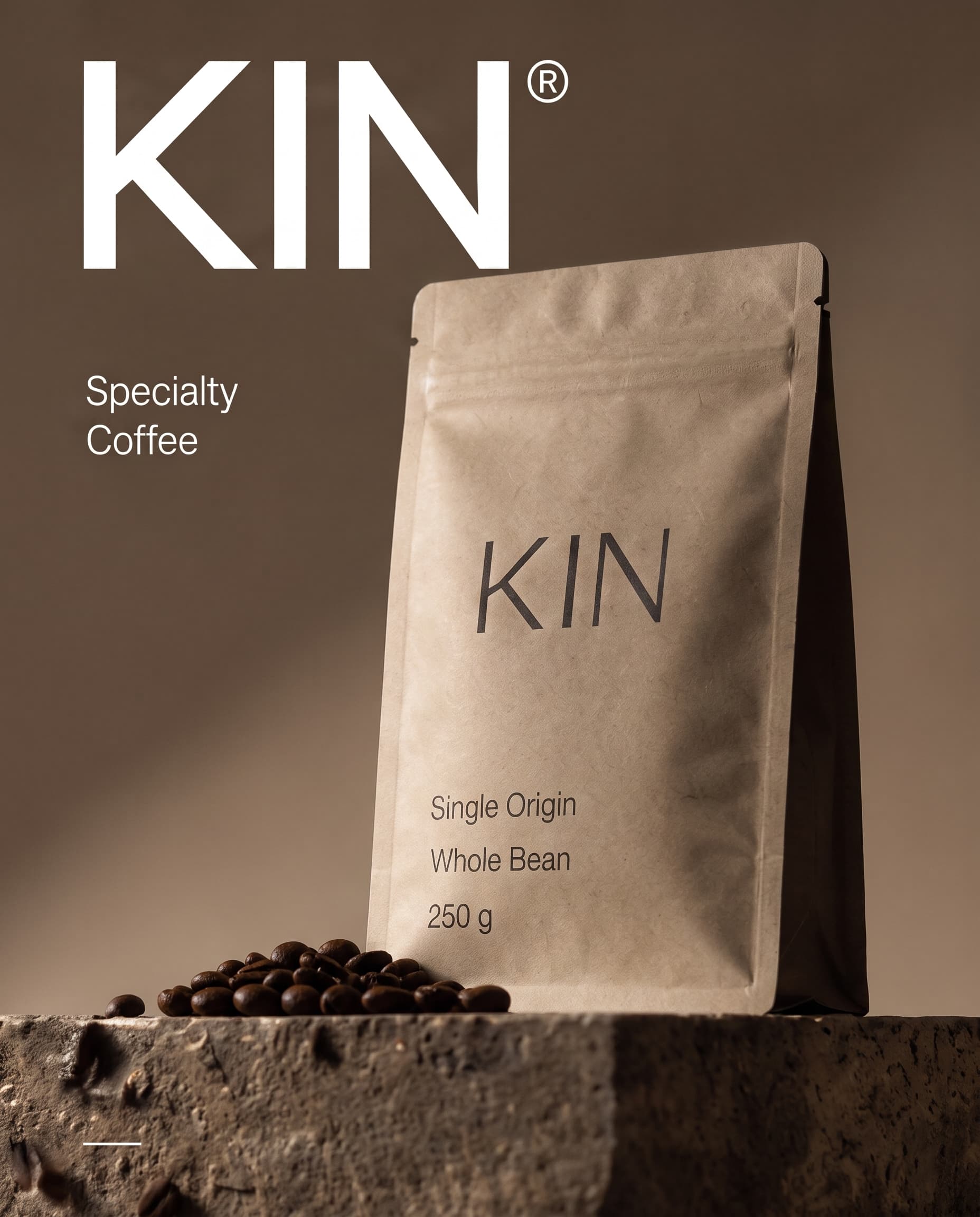
Packaging and identity for a small-batch roaster that wanted the coffee, not the bag, to do the talking.
Packaging
Brand identity
The brief
KIN roasts single-origin beans in small batches and sells them online and through a handful of cafés. Its old bags were loud and inconsistent, and nothing on the shelf told people what they were actually buying.
What I designed
I stripped the pack back to kraft paper, one wordmark and the few facts people look for.
A recyclable kraft pouch with the wordmark set large and quiet.
A clear order of information: origin, process, weight and roast date.
A modular label system, so every new lot ships without a redesign.
Product photography direction with stone, shadow and loose beans.
The result
A pack that is cheaper to print, easy to extend to every new origin and instantly recognisable on a café shelf.
Origin, process and weight, printed straight onto the kraft.Detail